Vapor chart user's manual
Table of contents
© R. GICQUEL 1998 - 2022. All rights reserved. This document may not be reproduced in whole or in part without the author’s express written permission, except for the personal licensee’s use and solely in accordance with the contractual terms indicated in the software license agreement.
Information in this document is subject to change without notice and does not represent a commitment on the part of the author
Overall presentation
The THERMOPTIM ® series (www.thermoptim.org) is a set of software tools dedicated to the learning and better understanding of applied thermodynamics. It is comprised of easy to use interactive charts: ideal gases, vapors mixtures of an ideal gas and of water vapor (psychrometrics), and a modeling software package including four closely interconnected working environments : a diagram editor (synoptic screen), a simulator, the interactive charts, and an optimization tool.
The interactive charts have been developed with a view to replace classical paper thermodynamic charts. Indeed, whatever care is taken by editors in the choice of color sets for distinguishing the various curves shown on the classical charts, it is always difficult to read them, and interpolation may lead to significant errors. New THERMOPTIM charts allow one, by a simple mouse click, to display all relevant thermodynamic properties of the fluid, thus providing better accuracy. Their main asset is to be very easy to use: the thermodynamic properties are immediately displayed on the screen, a user-friendly point editor allows the user to refine his/her cycle analysis and to export the values in spreadsheets or text editors.
THERMOPTIM is applied thermodynamics software whose objective is to allow one to easily calculate complex thermodynamic cycles without making very simplistic hypotheses or without being involved in tedious calculations. Initially it has been developed to help solve problems encountered in teaching applied thermodynamics. Its present functionalities make it possible to use it for also solving much more complicated problems such as industrial schematic design (for instance it has been used for the system integration of advanced electricity generation production plants involving several hundreds of components).
In this manual, we shall present the vapor charts, successively showing how to :
- customize the working environnement (substance and chart type selection, temperature unit choice, calculation settings, choice of the line width and color, layout of the axes…)
- use the chart to display a point and recalculate it
- work with point selections (named cycles), saving and loading them
- print a chart and exit the application
Thermodynamic properties of substances
The software includes a data base with the thermophysical properties of the substances considered, which are all pure condensable vapors.
The accuracy of the calculations is excellent for water (comparative tests with ASME steam tables give, for compressions and expansions, relative errors with enthalpies lower than 0.02 % in the vapor and liquid-vapor equilibrium, and lower than 0.5 % for the compressions in the liquid state).
For the other condensable vapors, the accuracy is slightly lower, the major deviations taking place in the liquid zone for reduced pressures greater than 0.7 and in particular supercritical. For these substances, liquid values are not modeled very accurately, the liquid being considered to be non compressible. In practice however, this is not very important for most applied thermodynamics processes.
Detailed information on the equations used can be found in the following references:
Energy Systems, A New Approach to Engineering Thermodynamics, 2011
Energy Systems, A New Approach to Engineering Thermodynamics, 2nd Edition, 2021
Internationalisation, number formatting
The interactive charts exist in several languages (english, french, spanish, portuguese, catalan). They are configured in the language corresponding to the inth.zip file located in the installation directory.
Numbers are automatically formatted in accordance with the language selected in the computer system. For instance, in english, the decimal separator is the dot, and the thousand one the comma ; in french the decimal separator is the comma, and the thousand one the space.
If you enter an ill-formated number, it is truncated at the level of the first non numerical character.
Customizing the working environnement
The working environnement of interactive charts can be customized in several ways so that you can adapt it to your own taste. When you first run the software, default values are used. Subsequently, your modifications are automatically saved in various configuration files, so that your selections are kept between two sessions.
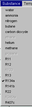
Substance selection
Depending on your software version, you have acces to more or less substances. The list of available substances is shown in menu "Substance". To select a substance, click on its name. Automatically, the screen is updated and the new substance appears.
Displaying substance properties
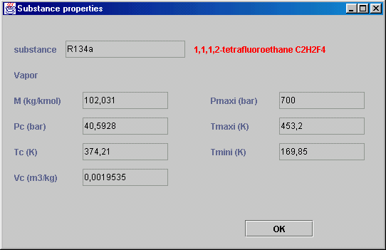
You can display a frame summarizing the substance properties from menu Chart. The substance name, its chemical formula, molar mass, critical properties and the limits of validity of the chart are shown.
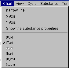
Selection of the chart type
The substance properties can be displayed in several coordinate systems used by thermodynamicians.
For vapors the following charts may be available depending on the substance:
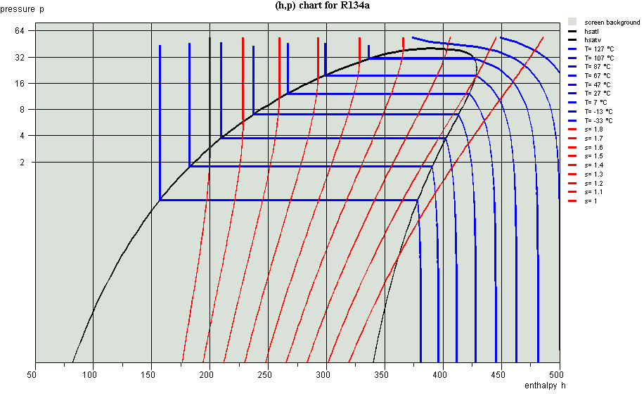
- (h,P) refrigeration chart, generally in semi-logarithmic scale, with enthalpy in abscissa and pressure in ordinate ;
- (T,s) entropic chart, with entropy in abscissa and temperature in ordinate ;
- (P,v) Clapeyron chart, with volume in abscissa and pressure in ordinate ;
- (h,s) Mollier chart, with enthalpy in abscissa and entropy in ordinate ;
- (h,xh) exergy chart, with enthalpy in abscissa and exergy in ordinate ;
- (s,xh) exergy chart, with entropy in abscissa and exergy in ordinate.
When a chart is selected, available substances are enabled in the substance list. Similarly, when a substance is selected, the available charts are enabled in the chart type list. To select one of the types, click on the corresponding menu item. The screen is immediately updated.
Choice of the temperature unit and of the environment reference temperature T0

Temperatures can be expressed either in Kelvin or in Celsius degrees. To select the unit chosen, click on menu item "K" or "°C" of menu "Temperature". For (h,xh) and (s,xh) exergy charts, the environment reference temperature T0 can be modified from menu "Temperature". A frame asks you to enter the T0 value, either in Kelvin or Celsius depending on the unit chosen. When you quit, the T0 value is saved in the chart parameter file.
Choosing the line width
By default, the curves are plotted in bold line.You can reduce the line width by clicking on the menu item "narrow line" of the menu "Chart". It is then labelled "bold line". If you select it subsequently the lines are again plotted in bold lines.
Modifying line and screen background colors
The whole set of colors used for plotting curves and for the screen background can be customized. To modify a color, double-click on one of the small rectangles where it appears in the legend on the right of the screen.
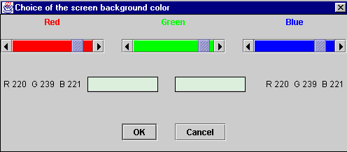
The color editor is displayed (this example retates to the default screen background color).
Three cursors corresponding to the red, green and blue components of the color allow you to customize the color. In the rectangle located center left, the original color is displayed, whereas the new one is shown in the right one, reflecting the cursor moves. When you have made your selection, click on "OK". The color is saved.
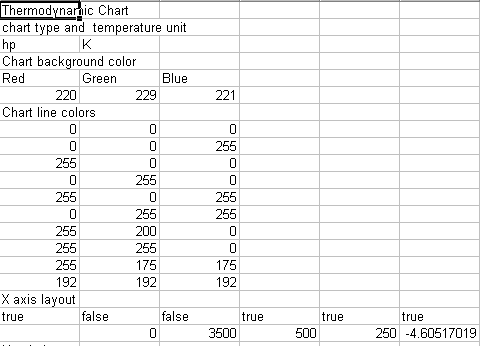
Watch out: in order to allow for independently customizing each substance and each chart type, the color modifications are only relative to the substance and the chart type selected. If you wish to apply your color selection to all substances and chart types, it is of course possible to repeat the color selection process for each substance as explained above, but the task will be tedious. Another way of doing it consists in directly modifying the chart initialization files, which are structured as shown below:
These files are named xxxxhp.txt for the (h,P) chart, or xxxxTs.txt for the (T,s) chart, and located in the directory data, xxxx being the substance name. The list of the RGB color codes is given in eleven lines, the first one relative to the screen background, the ten others relative to the various curve colors.
Applying a set of colors to other substances and chart types can be done very easily by copying these eleven lines in the corresponding files. It is recommended however to make a copy of the initial files before modifying them.
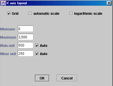
Changing the axes layout
The abscissa and ordinate axes layout can be modified by selecting the menu item "X Axis" ou "Y Axis" of menu "Chart".
If you select checkbox "Grid", vertical lines for the abscissa axis and horizontal lines for the ordinate axis are plotted on the chart, at the main unit tick.
If you select checkbox "automatic scale", the software searches a scale covering the whole range of values. The scale is logarithmic if you select the corresponding checkbox, linear otherwise.
When the "automatic scale" checkbox is not selected, you can enter the minimum and maximum values that you wish. The values of the main and minor units can be either automatically calculated, either entered by you, depending whether the corresponding "Auto" checkbox is selected or not. If the unit values are not consistent with those of the minimum and maximum or between themselves, a beep warns you.
Watch out: if the "automatic scale" checkbox is selected, your values will be replaced by those that the software will calculate.
When you are done with your modifications, click on "OK" to save the new layout, or on "Cancel" to go back to the previous values.
Chart use, display and recalculation of a point
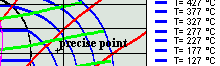
Using the interactive charts is quite simple: position the crosshair cursor at the point whose thermodynamic properties you wish to get, and click so that they may be displayed on the screen. For the vapor charts these properties are: pressure (bar), temperature (K or °C), enthalpy (kJ/kg), entropy (kJ/kg/K), mass volume (m3/kg) and quality (dimensionless ratio of the mass of the gaseous phase to the total mass).
As the cursor positionning accuracy is a function of the screen resolution and is generally not very high, it is possible to make more precise calculations either by moving a target with the keyboard arrows, or by creating and editing points (named cycle points as a set of points usually represents a thermodynamical cycle).
Using keyboard arrows
It is possible to refine the positionning of the cursor with the keyboard arrows. To do that, click close to the point whose properties you wish to get. The values are displayed in blue above the chart. If you press one of the keyboard arrows, a red target appears and is moved in one of the four cardinal directions by an increment equal to 1/1000 of the horizontal or vertical scale depending on the arrow key used. The point properties are recalculated, so that you can gradually get closer to the desired point. By changing the chart scale as indicated in the section entitled "Changing the axes layout", you can change the displacement sensitivity.
As soon as the red target appears, the mouse click is disabled, and the target can only be moved by the keyboard arrows. To take control again on the cursor, you can either :
- press the "Escape" key. The red target disappears and is displayed again only when you press one of the arrows, close to the location you last clicked the mouse. If you have not clicked since it disappeared, it appears where it previously was.
- double-click, which creates a point (see below) positionned on the target.
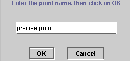
Point creation
To create a point, double-click at the requested location. A dialog frame asks you to enter a name to identify the point.
Once the point is named it is displayed on the screen in the form of a little cross and its label.
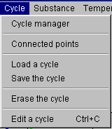
You can open an editor which allows you to modify the point and recalculate it. To do that, select the menu item "Edit a cycle" of menu "Cycle" or type Control C:
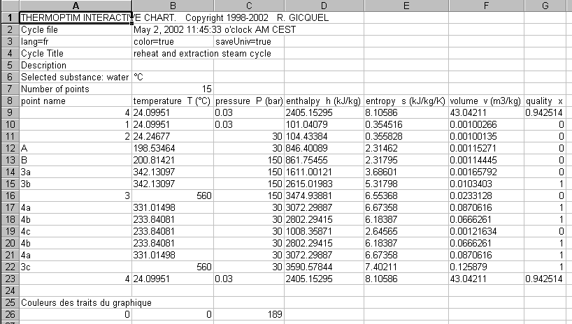
The cycle editor is then displayed. In its upper zone there are text fields which allow you to add comments on the cycle if you wish to do so, in particular for saving the cycle. The title is used for identifying the cycle in the cycle manager (see below). If you simply wish to recalculate a point, this is not necessary. In the lower part of the screen is a table comprising in columns the name of the point and its thermodynamic properties, and in lines each point entered (only one at this stage).
All the possibilities offered by the cycle point editor will be presented in detail later. For the time being, we will just show how to recalculate a point.
The point table has a particular feature: you can change the column order by clicking and dragging one of them by its label. For instance, if you click on the label "Temperature T" and that, keeping the mouse pressed, you move it on the right, the pressure column automatically is shifted to the second location.


If you keep on moving in the right direction, the enthalpy column is shifted in turn, and so on. After two moves, you get this result.
THERMOPTIM interactive charts make use of this editor property to specify the input variables used when a point is calculated: the two first figure columns from the left are considered by the software as designing the known state variables from which the other thermodynamic properties are calculated.
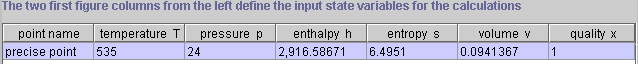
Suppose that you wish to calculate a point with a pressure of 24 bars and a temperature of 535 K. Enter these values in the corresponding cells, making sure to indicate that the cell editing is finished by pressing enter or clicking in another cell. Click then on the button "Recalculate" located in the lower right part of the editor. The point is recalculated and the values displayed :

If you wish the point with a pressure of 24 bars and an entropy of 6.5 kJ/kg/K, move the entropy column in second or third position, enter this value, then click on the button "Recalculate". You get the following result:
As you can see, calculating a point with accuracy is very easy.
All variable couples comprising either the temperature or the pressure can be calculated, except those which include the mass volume. When the quality is one of the input variables, the software considers that the point is located in the liquid-vapor equilibrium zone. If the second input variable is the temperature, the calculated pressure is set equal to the saturation pressure at the given temperature. If the second input variable is the pressure, the calculated temperature is set equal to the saturation temperature at the given pressure. It is thus possible to set the point on the saturation curve: if the quality is equal to 0, it is located on the saturated liquid curve, if it is equal to 1, it is located on the saturated vapor curve.
It is also possible to recalculate (h,s) couples for substances whose Mollier chart can be plotted.
Once the point is recalculated as you wish, the modifications made in the editor can be transferred on the chart by clicking on button "Validate". Automatically, the editor table points are then repositionned on the screen.

Once you are back in the main chart window, you can enter additional points. If you want to display them in the cycle points editor, you must select again menu item "Edit a cycle" of menu "Cycle". If the editor was previously opened, a message informs you that the points will not be validated if you continue.
The reason for this is that the software cannot guess which values are the right ones: those from the chart or those from the editor. If you do not want to validate the points previously modified, click on "OK". Otherwise cancel, and then go into the editor, validate the old points, and iterate.
Cycle handling
You now know how to create and modify points. In next pages, we shall refer to a set of points as a cycle.
Point creation from the cycle editor
In addition to the recalculation and validation functions discussed previously, the cycle editor is equipped with five other buttons : "Insert", "Copy" and "Suppress", which allow you to add, copy or suppress one table line, and "Print" and "Cancel" which allow you to print the table or to close the frame. Furthermore, on the right of the frame appear two small arrows which can be used to move a line to the next above or below position.
To add a new point, select one line, then click on "Insert". The software inserts a new line just above the previous one, all the values being set to zero. Name this new point, choose two input variables, move the corresponding columns on the left and enter their values, then click on "Recalculate" to get all the point thermodynamical properties.
Once the new line is inserted, you can also copy another line and paste it. To do that, select the line corresponding to the point that you wish to copy, and click on "Copy". The button label is modified and becomes "Paste". Select the destination line, and click on "Paste". The values are copied.
To suppress a line, select it then click on "Suppress".
Once the points are created as you wish, click on "Validate" to have them transferred on the chart and displayed.
To print the table, click on "Print" and select the paper format from the printer dialogs, then confirm the printing.
Connecting points
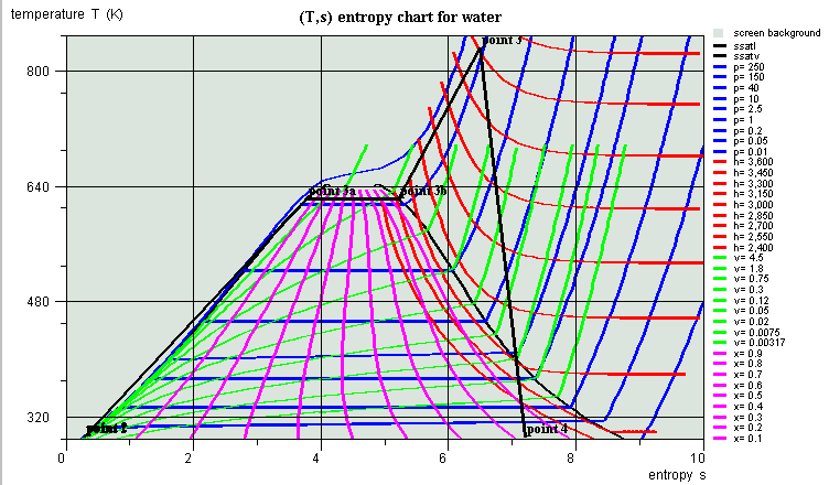
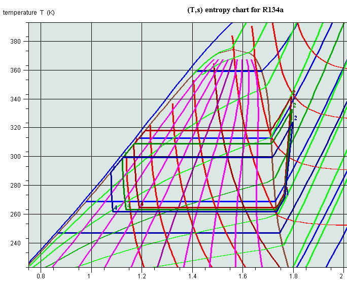
When the points are displayed on the chart, they are disconnected by default. It is possible to connect them by a broken line by selecting the menu item "Connected points" of menu "Cycle". This way of doing is widely used for representing a thermo-dynamical cycle. In the following example is shown, on a entropic (T,s) chart a simplified reheat steam power plant (Rankine cycle).
The software connects the points in the same order as they appear in the editor, starting from the first line. If this order is not the right one, you may have to sort the points in the cycle editor.
To do that you can move the points using the arrows which appear in the right of the editor:
- select a line that you wish to move
- click on the up or down arrow to move the point to the previous or next line position
- when you have rearranged all points, end up by clicking on "Validate". The cycle is then displayed on the chart in the right order.
Improvements in cycle plotting
Version 1.4 brings a number of improvements in cycle plotting:
- first, it is possible to link points by various iso-value lines (isobaric, isentropic...)
- second, each cycle color may be changed according to the user desire
- third, several cycles can be plotted on the same chart
Linking points by iso-value lines
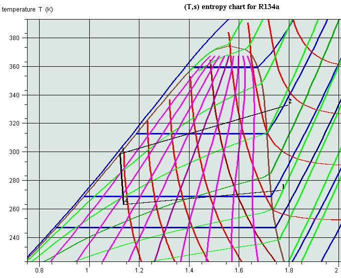
Let us consider a simple refrigeration cycle where the condenser and evaporator are respectively globally modeled, the liquid, vapor and diphasic phases being not distinguished. When the cycle is first plotted on a R134a (T, s) chart, the cycle appears as above: the points are connected by straight lines. Opening the cycle point editor displays the cycle elements as below.
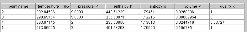
It is possible to connect points 2 and 3 by an isobaric line: select both lines 2 and 3 at the same time, and click on "Insert". A combo box with various iso-value choices is shown. Select "iso-pressure". You are requested to give the number of points you want to insert. Enter 10. The new points are created in the cycle point editor. Click on "Validate": the plot now follows the isobaric 9 bars line.
The number of points entered determines the number of segments with which the iso-value line is approximated. The larger their number, the better the accuracy.
Similarly you can connect points 4 and 1 with an iso-pressure line, and points 3 and 4 by an isenthalpic one (5 inserted points will do). In order to add an isentropic line between points 1 and 2, you first have to insert a blank line before point 2, and to copy and paste point 1 line there. You then select the new line 1 and line 2, and insert the isentropic points. In the end the chart plot becomes as shown here.
All the points inserted can be recalculated one by one if need be (i.e. if one of them does not exactly correspond to the user requirements). If necessary they can be suppressed either one by one or as a group, by selecting them and clicking on "Suppress".
If you want to save this cycle, just open the cycle point editor, enter any title and description you may wish and save it as explained below.
Cycle manager

A new menu line named "Cycle manager" has been added in menu "Cycle". If you select it you open this frame. If you click on "Update the cycle table", all cycles already loaded are displayed. Here, two cycles are loaded: the default one which is active, and a second one which has been loaded from a file.
The title defined in the cycle point editor is displayed as the cycle name.
You select the active cycle by choosing its line and clicking on "Set as active cycle". The active cycle has the following properties:
- it is connected to the simulator (when the charts used are connected to Thermoptim) ;
- it is the one on which the "Cycle" menu lines operate, i.e. it can be erased, saved, its points can be edited in the cycle point editor...
If you double-click on a line, you change the column "selected" status: if it is checked, the cycle is plotted on the chart, otherwise not. You can deselect all cycles by clicking on "Uncheck all cycles". You can suppress a cycle in the list by selecting its line and clicking on "Suppress". Its plot is also suppressed from the chart.
In the upper right of the screen is a multiple choice list that lets you choose the kind of plot of the selected cycle: solid line, dotted or dashed.
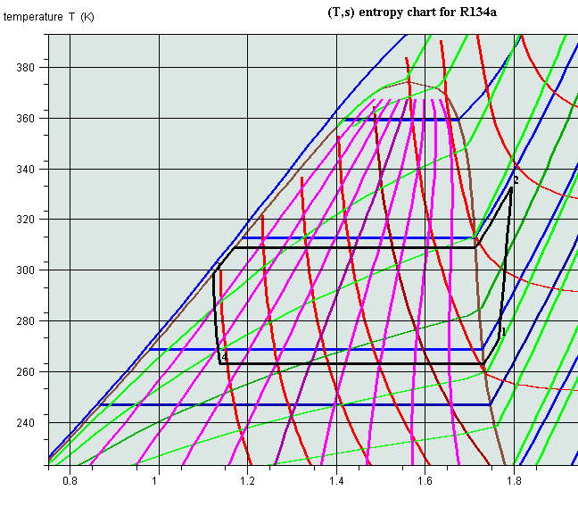
Changing the cycle color
Until version 1.3, all cycles were plotted in black. It is now possible to select any color in the same way as you do it for the chart curves. To change a cycle color, select its line and click on "Change the cycle color". A frame allowing you to choose its color is displayed. If you want to save the new color, set the cycle as the active one and save it. Suppressing the active cycle is equivalent to erasing it from the chart menu. You generate a new active cycle either by setting another cycle as the active one, or by interactively creating points in the chart, opening the cycle point editor and validating.
Superposition of several cycles on a chart
To plot several cycles on a chart, just load them together and set them as selected in the cycle manager screen. They automatically appear on the chart as shown here.
Erasing a cycle
It is possible to erase a cycle displayed on the screen: to do that, select menu item "Erase the cycle" of menu "Cycle". This operation suppresses the corresponding point values, which cannot be displayed again if the cycle has not been saved. If you just wish to hide a cycle from the screen, unselect it in the cycle manager frame by double-clicking on its line.
Saving a cycle
Once a set of points has been entered, and possibly recalculated and validated, it can be saved as an ASCII text file, in order to be subsequently processed either by the software, or by a spreadsheet or a text editor. To do that, select the menu item "Save the cycle" of menu "Cycle". A dialog window allowing you to name the file is shown. Name it and click on "Save" to save the cycle.
Loading a cycle
You can import in the software, either for displaying it or to process it, a cycle which has been saved previously, or created in another working environment. To do that you just have to configure a data file structured as follows:
In this example the file has been created by the software, but any file structured similarly can be read and processed. The line separator is the 'Enter' character, and the column separator the tabulation.
The two first lines are not taken into account (but they must exist). The third one provides various information: here the cycle is in colour and has been saved in a universal way (i.e. with the enclish format).
The fourth and fifth lines give in second column the cycle title and a comment describing it. If the first column cells are empty, these informations are not read.
The sixth line first column must include a text in which appears the name of the substance used (in order to warn the user if the substance selected for the chart is not the same as that for which the cycle has been calculated). The second column indicates the temperature unit.
The seventh line first column must be a non-empty text, and the second one the number of points.
The eighth line is not taken into account (but it must exist)
The following lines give the name and the values of the points, in the order given in the above example: name, temperature, pressure, enthalpy, entropy, volume, quality.
The two last lines define the cycle color with a RGB coding.
Any file structured similarly can be read by the software.
To import a cycle file, select the menu item "Load a cycle" of menu "Cycle". A dialog window allows you to select the file.
Printing a chart, end of session
Printing a chart
Printing a chart can be done either from the menu item "Print" of menu "File", or by the keyboard accelerator Control P. A printer selection screen is then displayed.
End of session
To quit the application, you can do it either from the menu item "Quit" of menu "File", either using the keyboard accelerator Control Q. A confirmation screen is displayed. The environnement parameters are automatically saved.
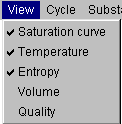
Selecting isovalue curve display
Menu "View" allows you to select the isovalue curves which are displayed on the screen:
Only those isovalues whose name is checked are plotted. If for instance you check only saturation curve, temperature and entropy, the chart looks as follows:
Thermodynamic charts of external mixtures
As explained in Volume 3 of the Thermoptim reference manual, the external classes allow one to define external substances, in particular external mixtures whose calculation is performed by thermodynamic properties servers.
External mixtures not being included in Thermoptim, the software does not provide their thermodynamic charts. To overcome this limitation, we added a new chart type, called external mixture chart, which allows the use of simplified entropy and (h,P) charts.
Creation of external mixture charts
The preparation of the chart background can be made thanks to a special external class called CreateMixtureCharts.java. You should refer to its documentation for further details on this topic.
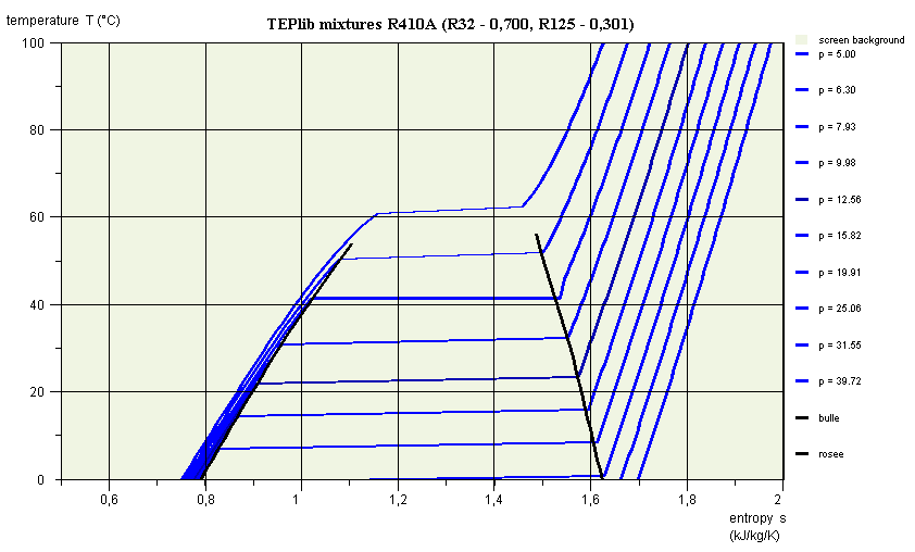
R410A entropy chart
The new charts are simplified compared to the others in that they show only the bubble and dew curves, as well as a single set of isovalues, i.e. the isobars for the entropy chart, and the isotherms for the (h, P) chart.
These charts being a variation of vapor charts, their use is explained in the documentation of these.
As shown in the entropy chart, the isobars are no longer horizontal segments in the liquid-vapor equilibrium zone, but curves slightly upward.
In the (h, P) chart, the isotherms are no longer horizontal segments in the liquid-vapor equilibrium zone, but curves slightly downward.

R410A (h, P) chart
Note that the characteristics of the model are recalled in these diagrams: server properties TEPlib mixtures, name of substance R410A, and molar composition.
Use of mixture charts in Thermoptim
For mixture charts to be available, a number of files must be prepared, as described in the documentation of the external CreateMixtureCharts.java class. We assume here that it was done.

Menu selection of the mixture
Charts are also loaded from the simulator / interactive chart interface, in which has been added an additional line called "external mixtures", which must be selected.
The chart screen is opened, but without a substance being selected.
The menu "Mixture data" allows you to do it. Select the line "Load the mixture". The list of available charts is displayed. Select the one of interest (here R410A).
Then select the line "Read the chart data file", which allows Thermoptim to read the two files defining the background. The carts of the previous figures are then available, the behavior of the external mixture chart being similar to that of an internal Thermoptim vapor chart.